
gabrielaarero@gmail.com
© GABSRR 2026
App Redesign · iOS
5 Main Screens
Academic · 2024
09
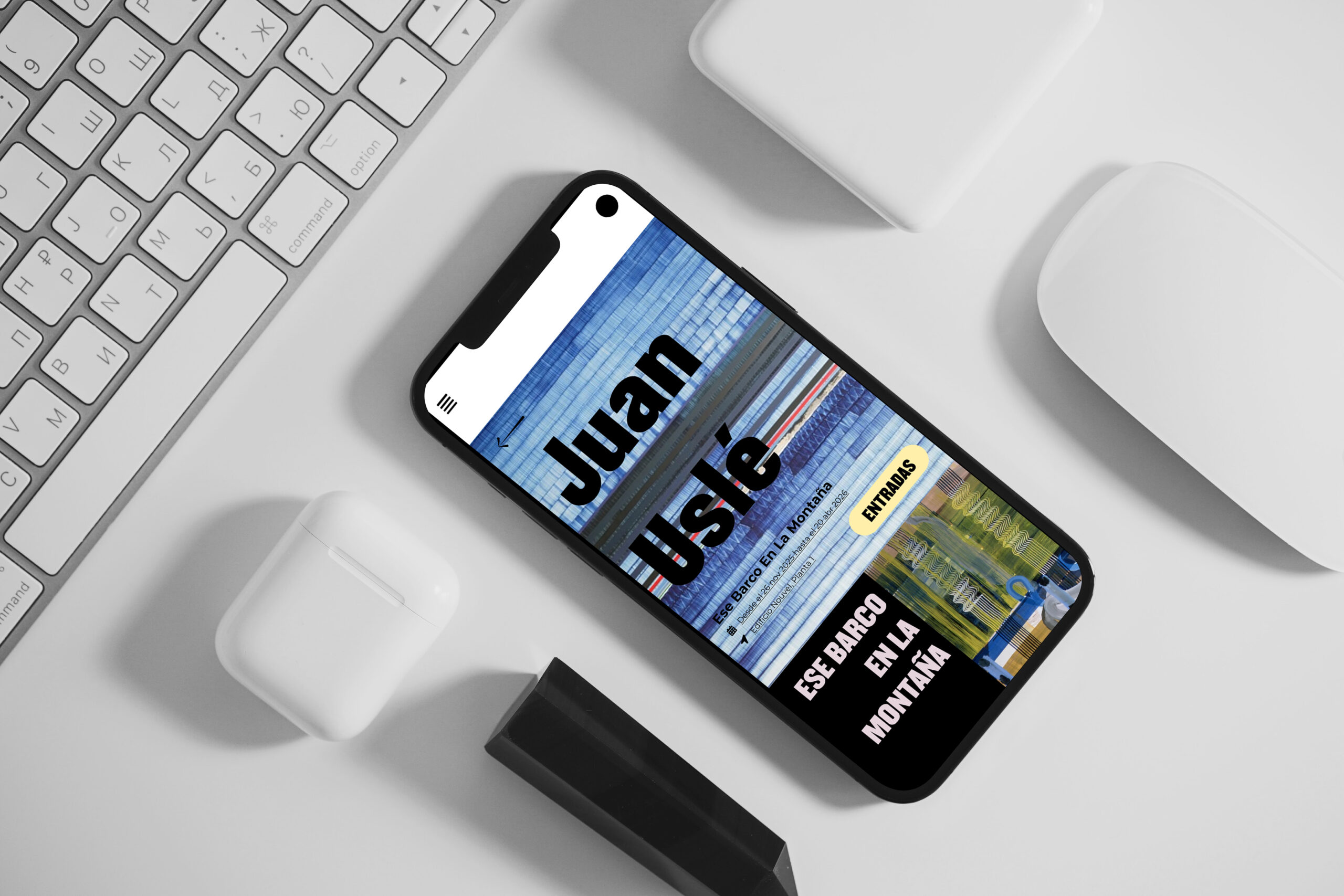
The Museo Reina Sofía had no dedicated mobile app. This redesign imagines what one could look like — not as a digital brochure, but as a genuine navigational tool for visitors and art enthusiasts. The design premise is simple: white backgrounds, black type, and let the artwork do the talking. When your content is Picasso, Dalí and Miró, the interface has no business competing with it.
Click any screen to expand it.
The Reina Sofía — one of the world's most important modern art museums — had no dedicated mobile application. Visitors navigated through a mobile website not designed for phone use: small text, poor image presentation, and no guided experience. The redesign started from a simple question: what would a visitor actually need on their phone?
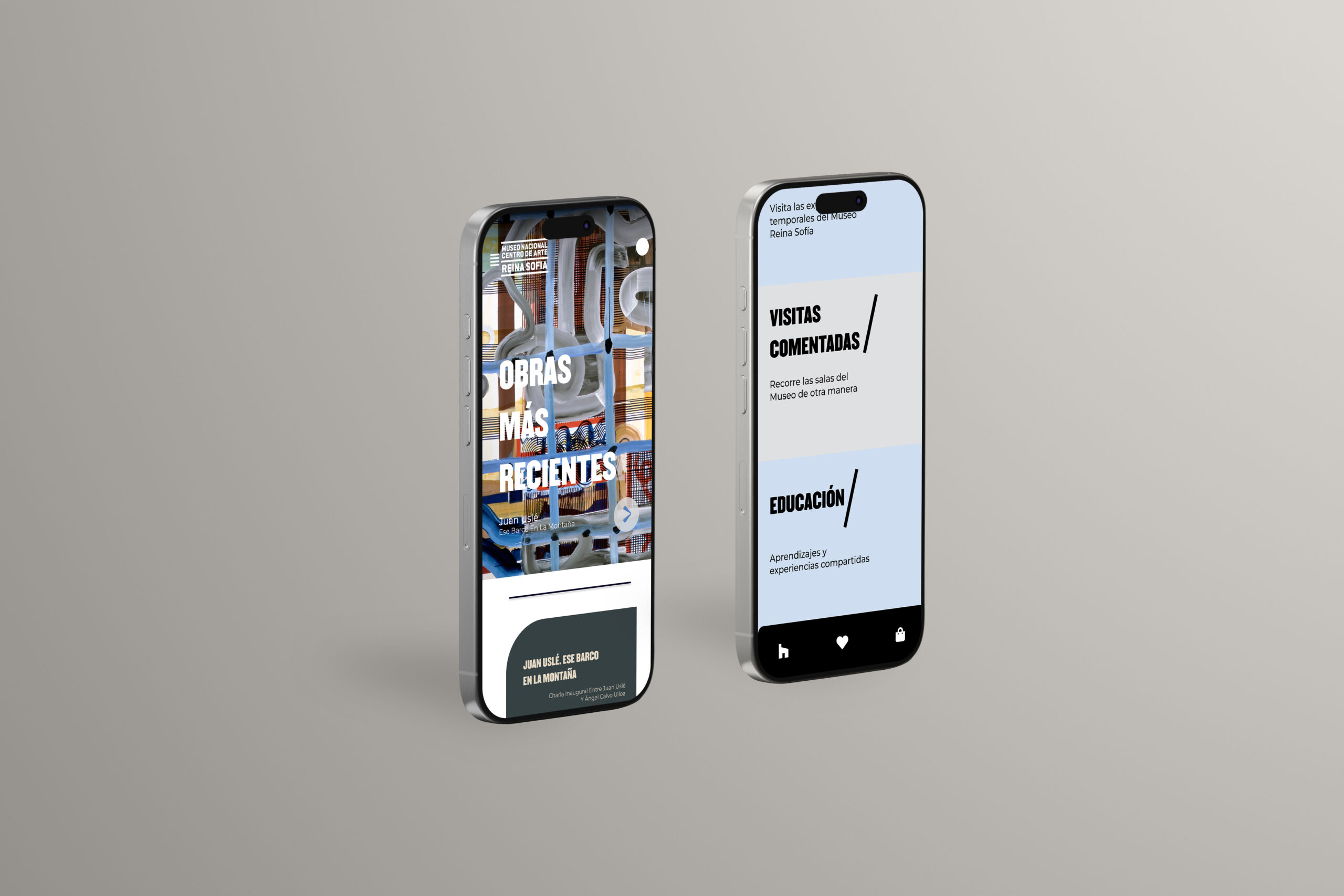
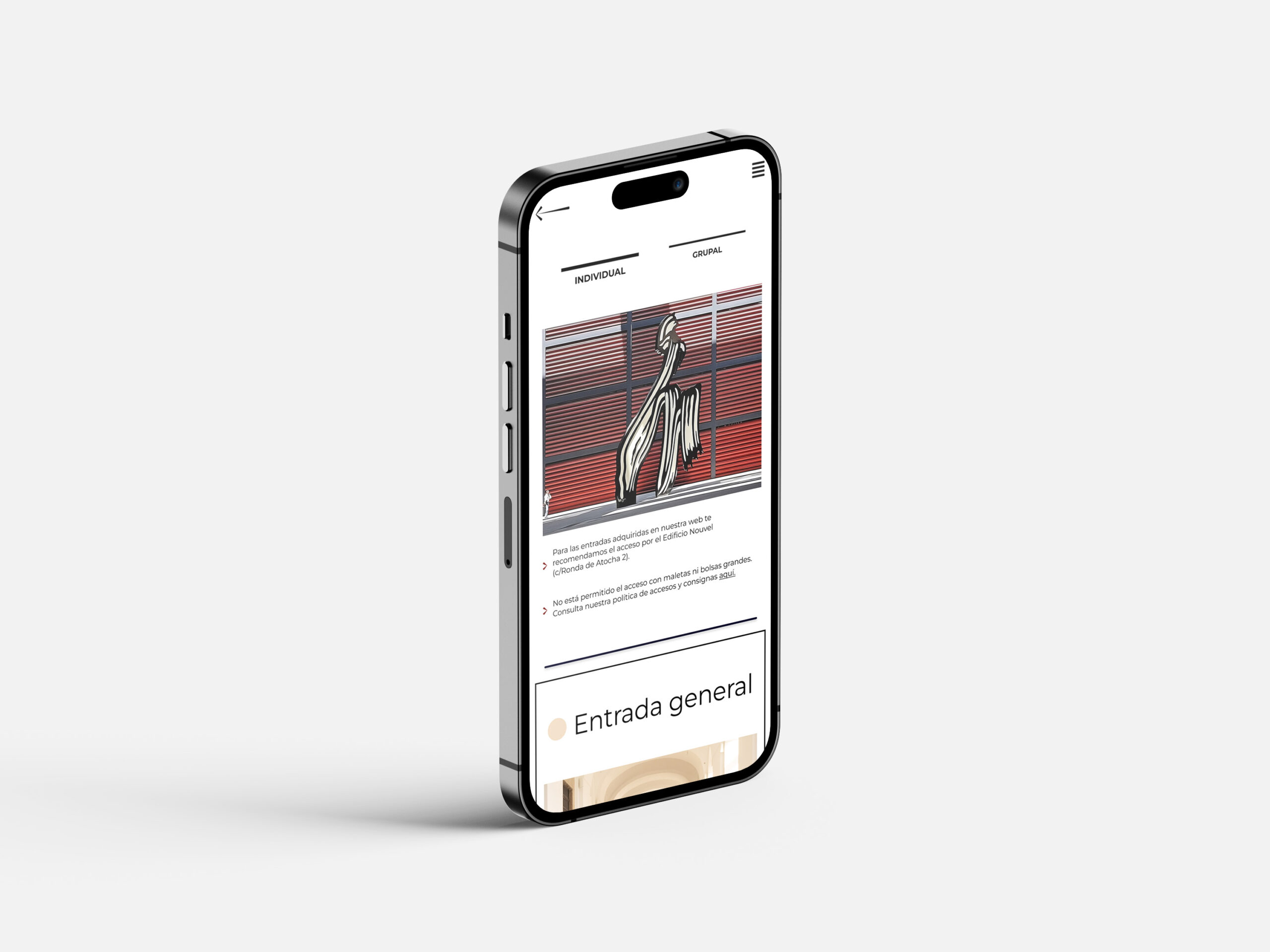
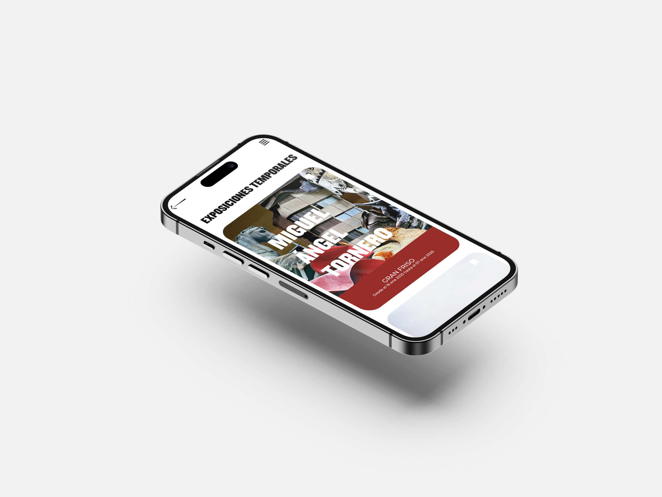
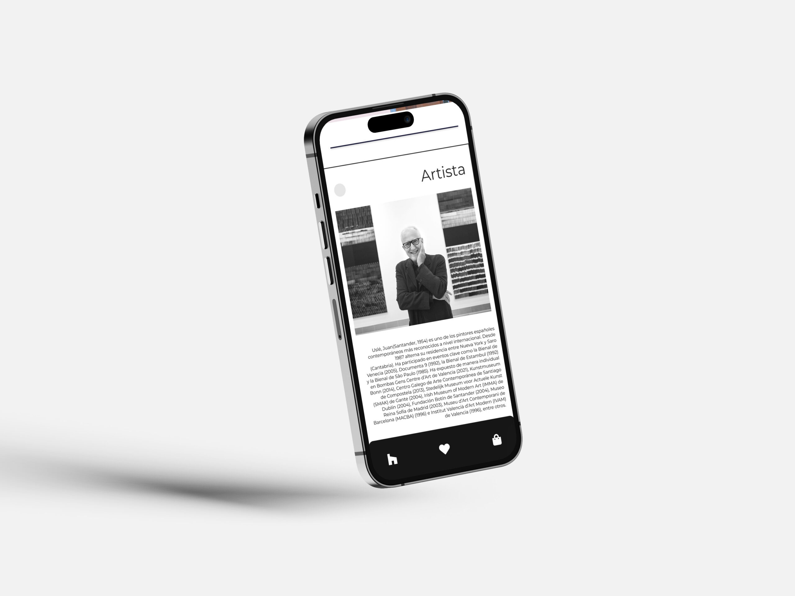
Home, Temporary Exhibitions, Collections, Artists, Guided Visits and Tickets — each section serves a distinct user need. The navigation structure was designed so that a first-time visitor and a returning art enthusiast can both find what they need without friction.
The visual system was built around a single constraint: never compete with the art. White backgrounds, a single typeface at multiple weights, no decorative elements, no icon clutter. Every color in the app comes from an artwork — the design is neutral so the collection can be vivid.
White canvas. The art brings the color.
Physical device mockups — no frames, no borders. Just the screens.
"Art at your fingertips, without the noise."
The Reina Sofía redesign is an exercise in restraint — in trusting that the content is strong enough that the design's job is simply to present it clearly. A museum app does not need to be exciting. It needs to be useful, beautiful in its clarity, and honest about what it is: a tool for getting closer to art.