
gabrielaarero@gmail.com
© GABSRR 2026
Typography
as news.
Special Edition
4 Pages · InDesign
Type Trends 2025
04
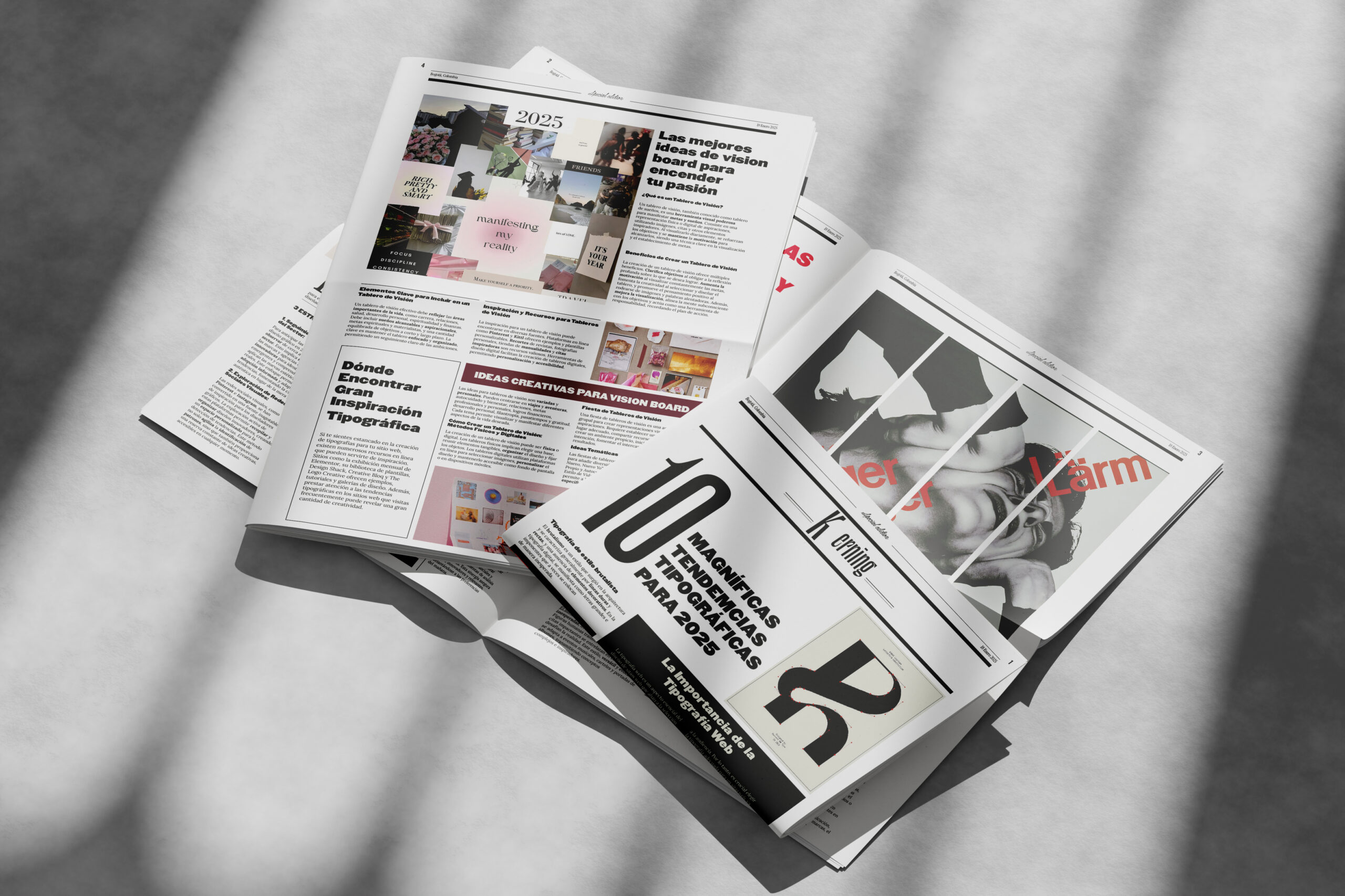
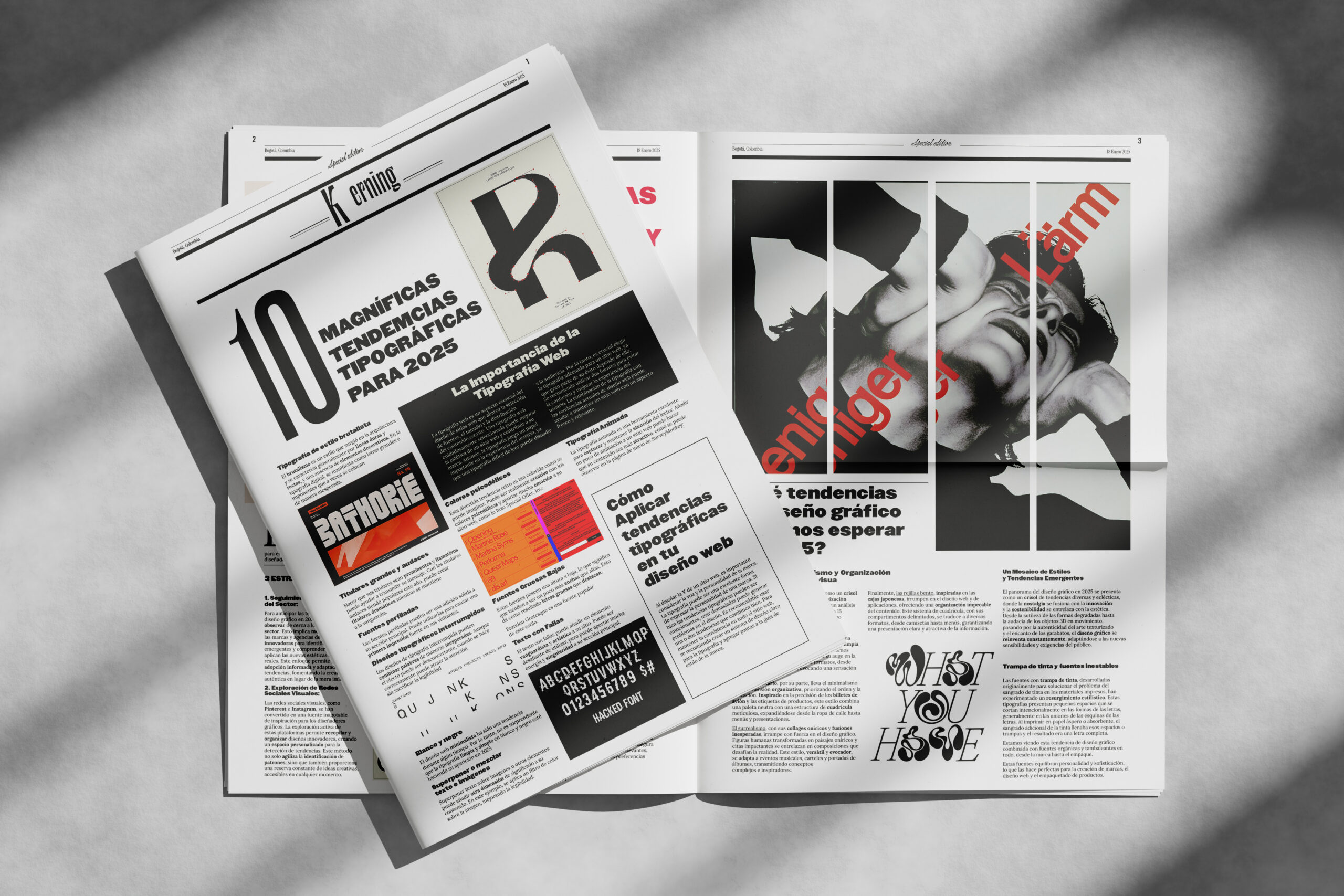
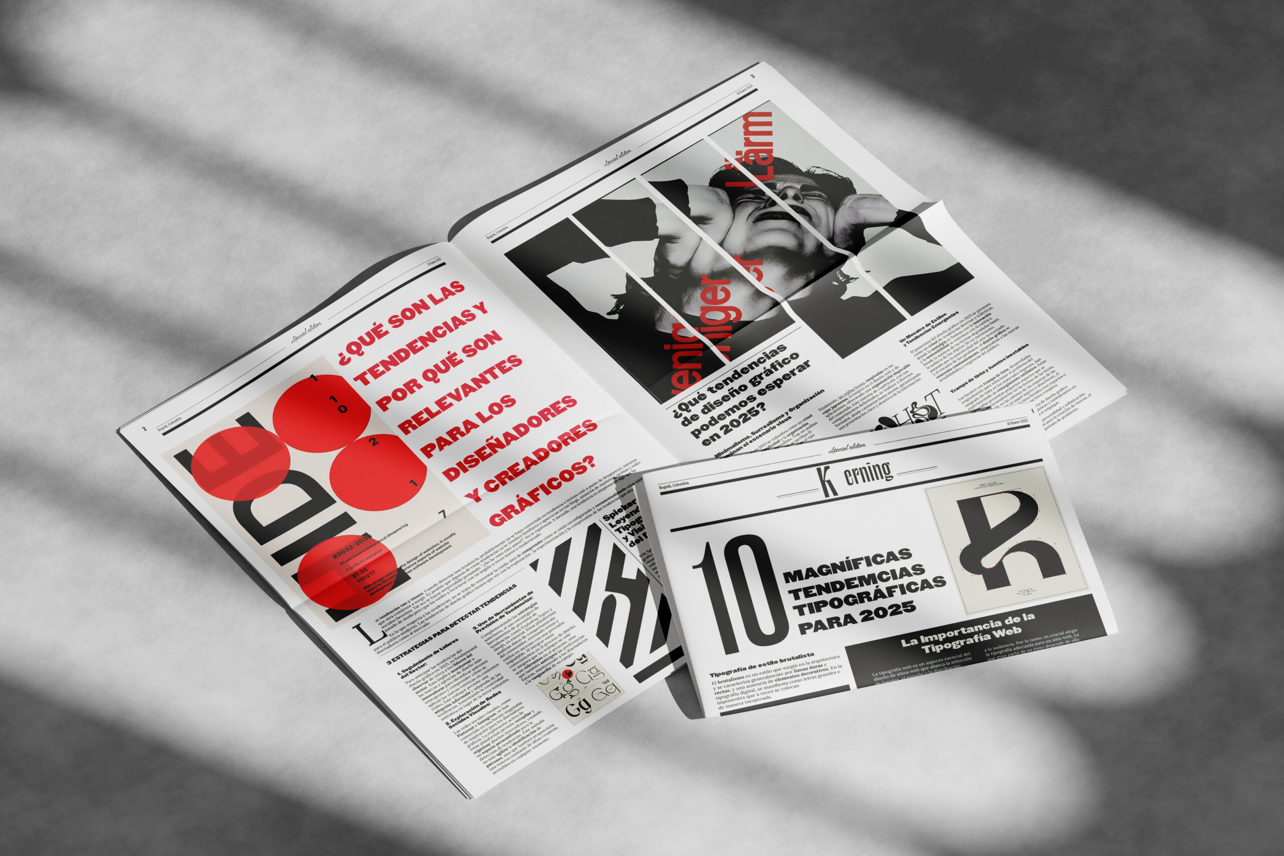
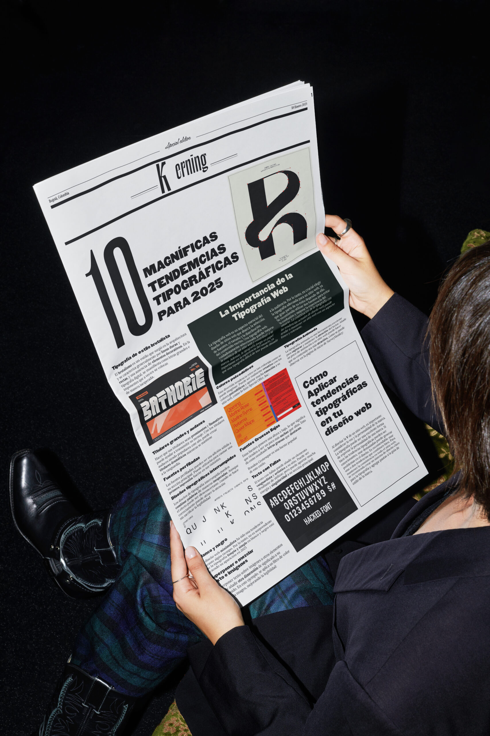
KERNING is a special-edition newspaper dedicated entirely to typographic trends for 2025. Designed in the format of a real tabloid — dateline, masthead, column grid, drop caps — the project investigates what happens when the discipline of type design becomes the subject of print journalism. Four pages. One palette. Hundreds of decisions about what it means to read a typeface before you read the words it makes.
Click any page to read it full size.
Printed. Folded. Read. A physical object designed to be held before it is understood.
The starting point was a contradiction: typography is the invisible medium of journalism — never the subject. KERNING inverts that order. The newspaper format is not decorative but structural: if the topic is type, the container must be the most honest typographic object that exists.
Black, white and red — the classic palette of emergency journalism, the union poster, the political fanzine. Red does not decorate: it signals, hierarchizes, interrupts. A 12-column grid allowed format shifts within the same page without losing coherence.
Each of the 4 pages carries its own dominant visual weight. In a special edition newspaper, there are no secondary pages. Every opening competes to be the first one you read. The result is a publication with no quiet interior — everything is a cover.
"Typography as news."
KERNING does not report on typography — it practices it. Every design decision is simultaneously the content and the argument: the tight tracking mentioned in the article is the same tracking used to write it. The publication cannot be separated from its subject because both are the same thing.