
gabrielaarero@gmail.com
© GABSRR 2026
FORMFONT applied.
12 months. 12 colors.
One typeface.
03
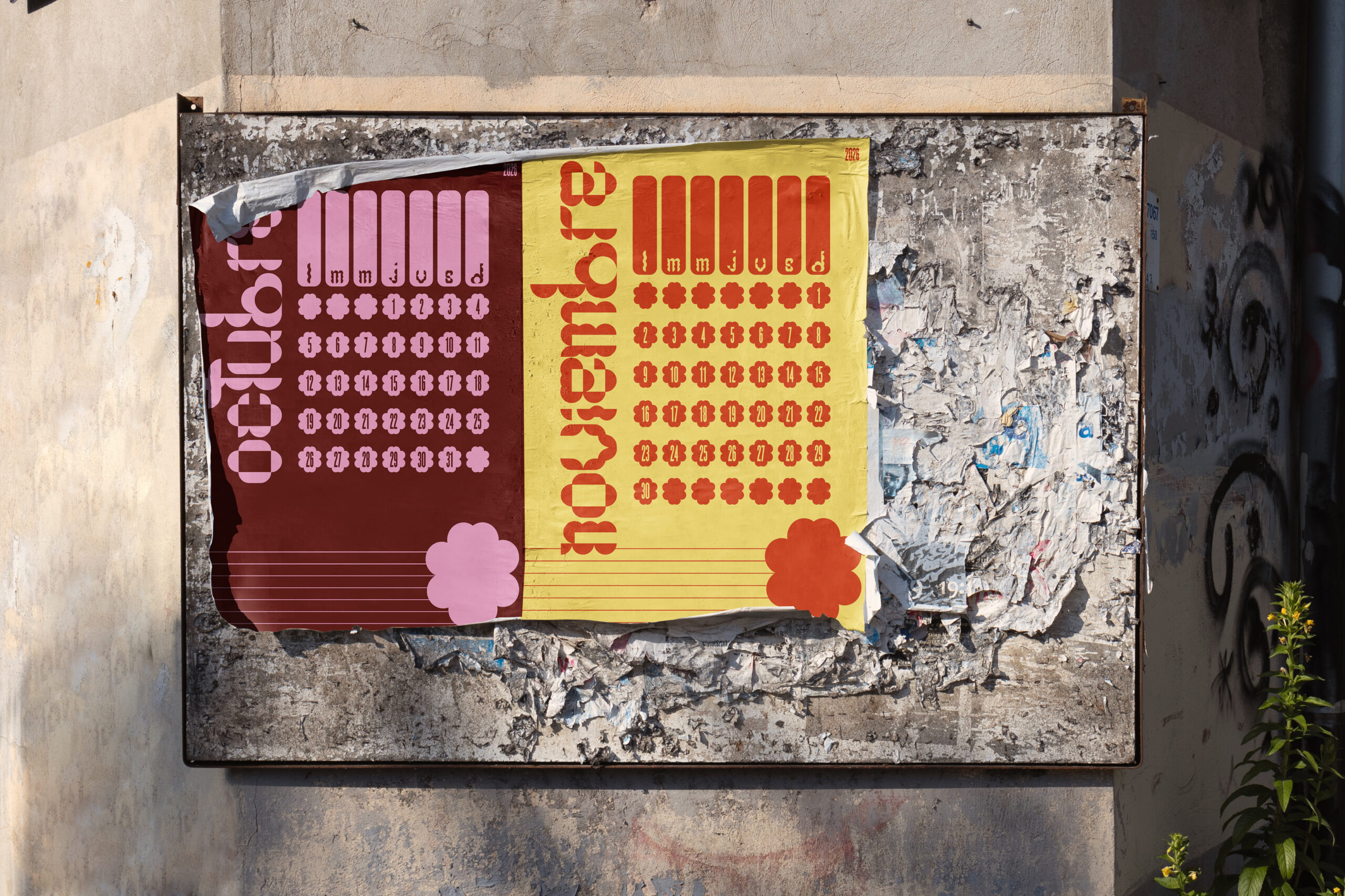
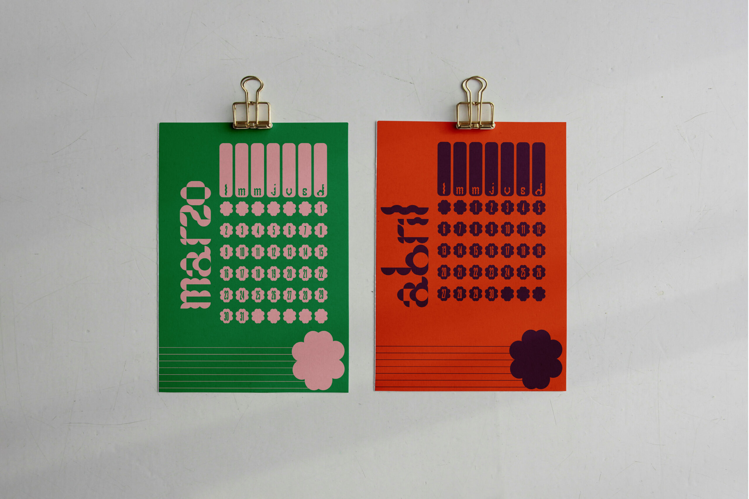
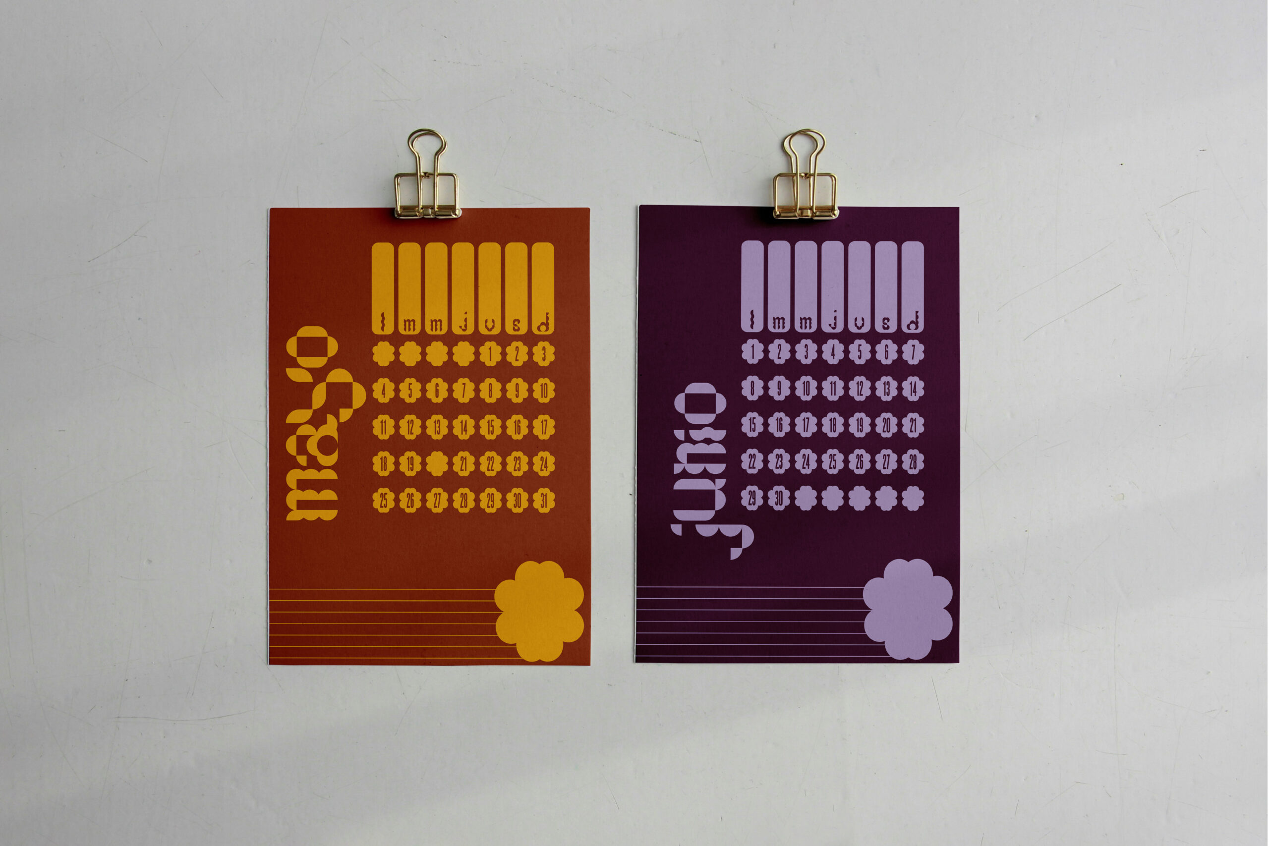
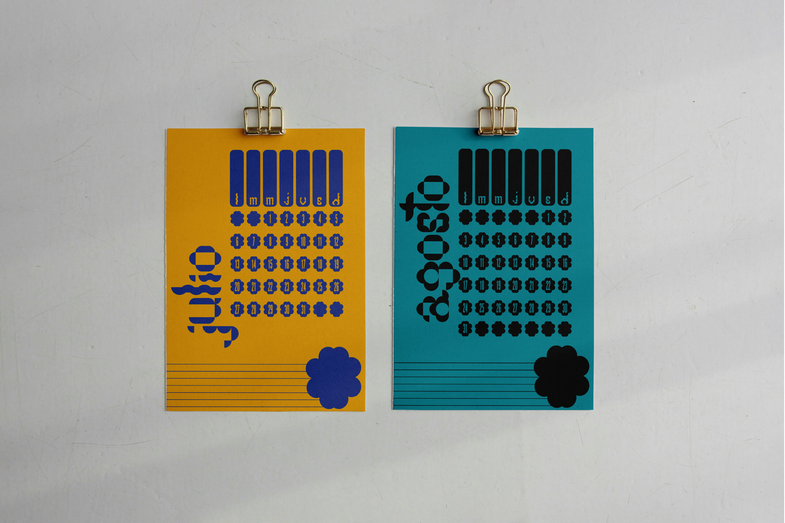
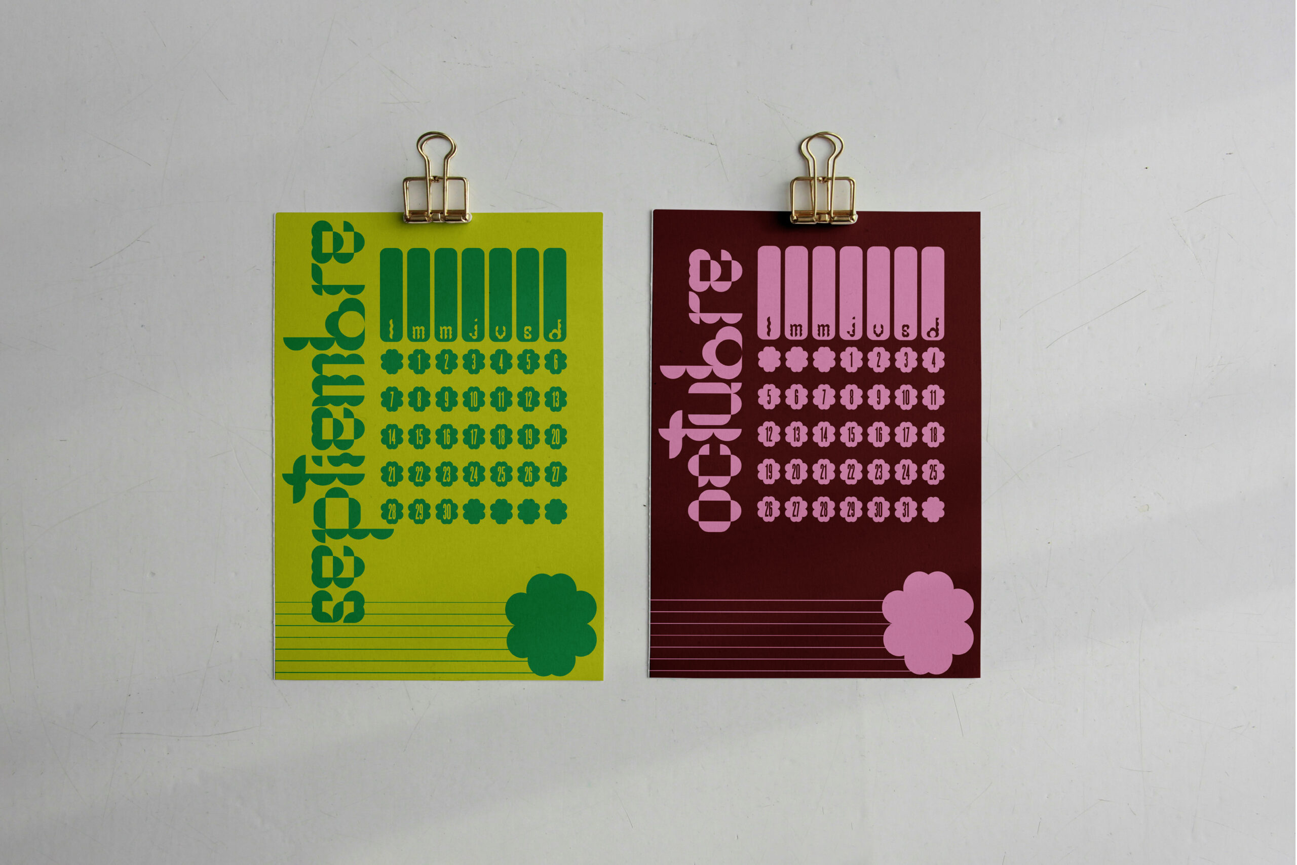
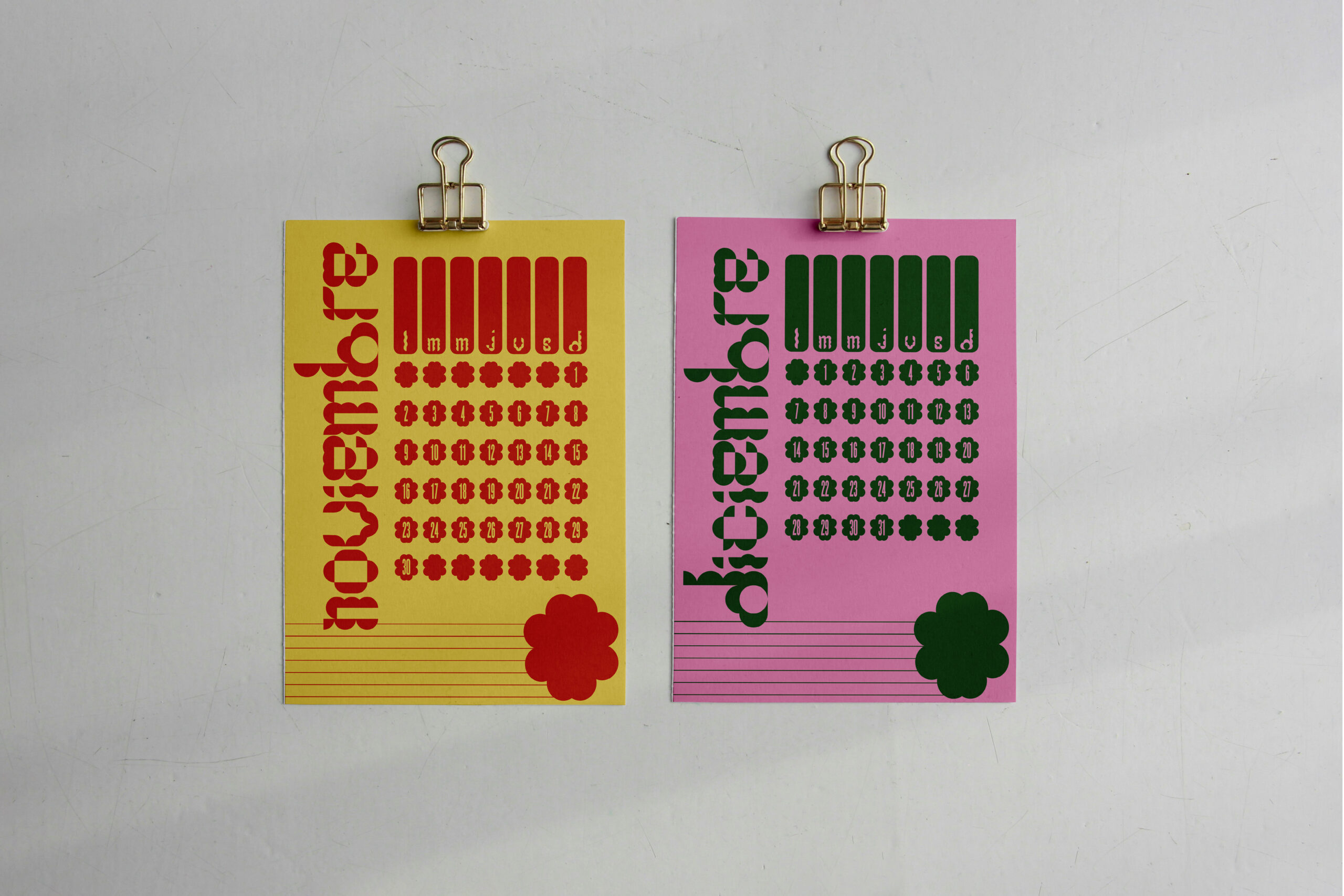
The 2026 Calendar is the first real-world application of FORMFONT — a custom display typeface built entirely from circles and semicircles on a 6×6 modular grid. Each month of the year was assigned its own color, creating a chromatic identity that makes time readable at a glance. Twelve editions. Twelve colors. One consistent geometric voice that runs through the entire year.
Each month carries its own chromatic identity — a color that makes time visible before you read the number.
Each month was assigned a distinct color — not arbitrary, but derived from a chromatic logic that moves through the spectrum across the year. The palette creates a visual timeline: you can tell the season from the color before you read the month. FORMFONT's geometric consistency means it holds its identity regardless of the background.
A typeface is not just letters — it is a set of rules. The 2026 Calendar was designed to prove that FORMFONT's rules could hold across twelve very different color environments. The challenge was systemic: how do you build something that stays coherent when the background changes every month?
The color selection was not a mood board exercise. Each color was chosen for its relationship to the others — hue, saturation, and perceived temperature all played a role. Twelve decisions that had to work as one system.
The 6×6 grid that governs the typeface also informed the calendar layout. The structure of the month — weeks, days, numbers — was arranged using the same proportional logic as the letterforms. The result is a calendar where the grid is visible in everything.
The calendar was designed to exist as a physical object — to sit on a desk, hang on a wall, and age through the year. Each page is meant to be torn off, keeping only the current month visible. The design had to hold up at print resolution and at actual size.
From screen to print — FORMFONT holds its geometry at any scale, on any color, in any month of the year.
"If a typeface has its own visual logic, it should be able to carry a system."
The 2026 Calendar is proof of concept — that a typeface designed with strict geometric rules can adapt to any color, any season, any month, without losing its identity. FORMFONT does not decorate the calendar. It is the calendar. The circles become numbers. The numbers become months. The months become a year.