gabrielaarero@gmail.com
© GABSRR 2026
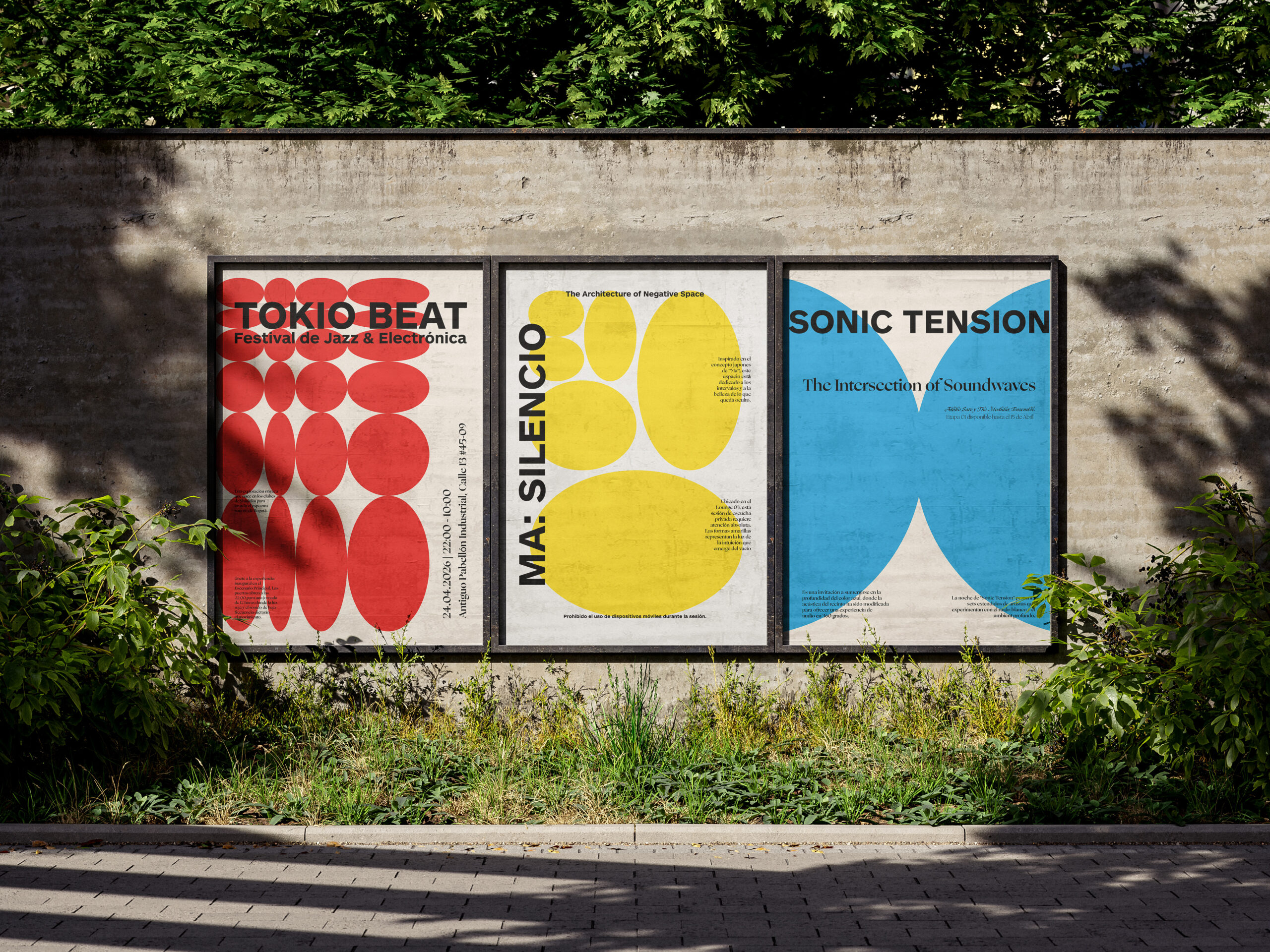
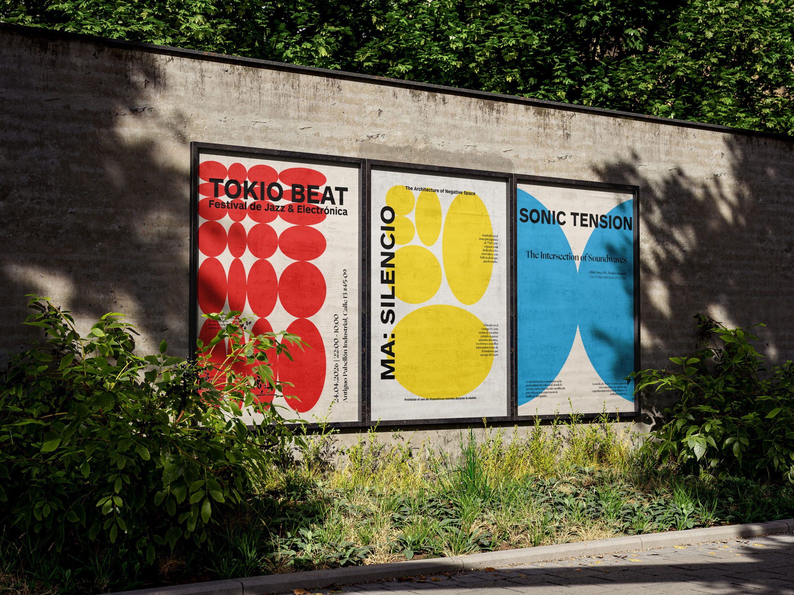
One festival.
Three events.
Three visual languages.
01
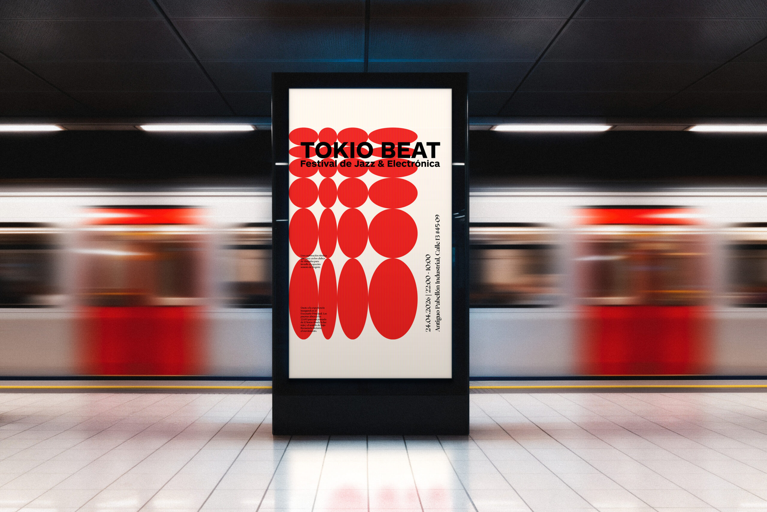
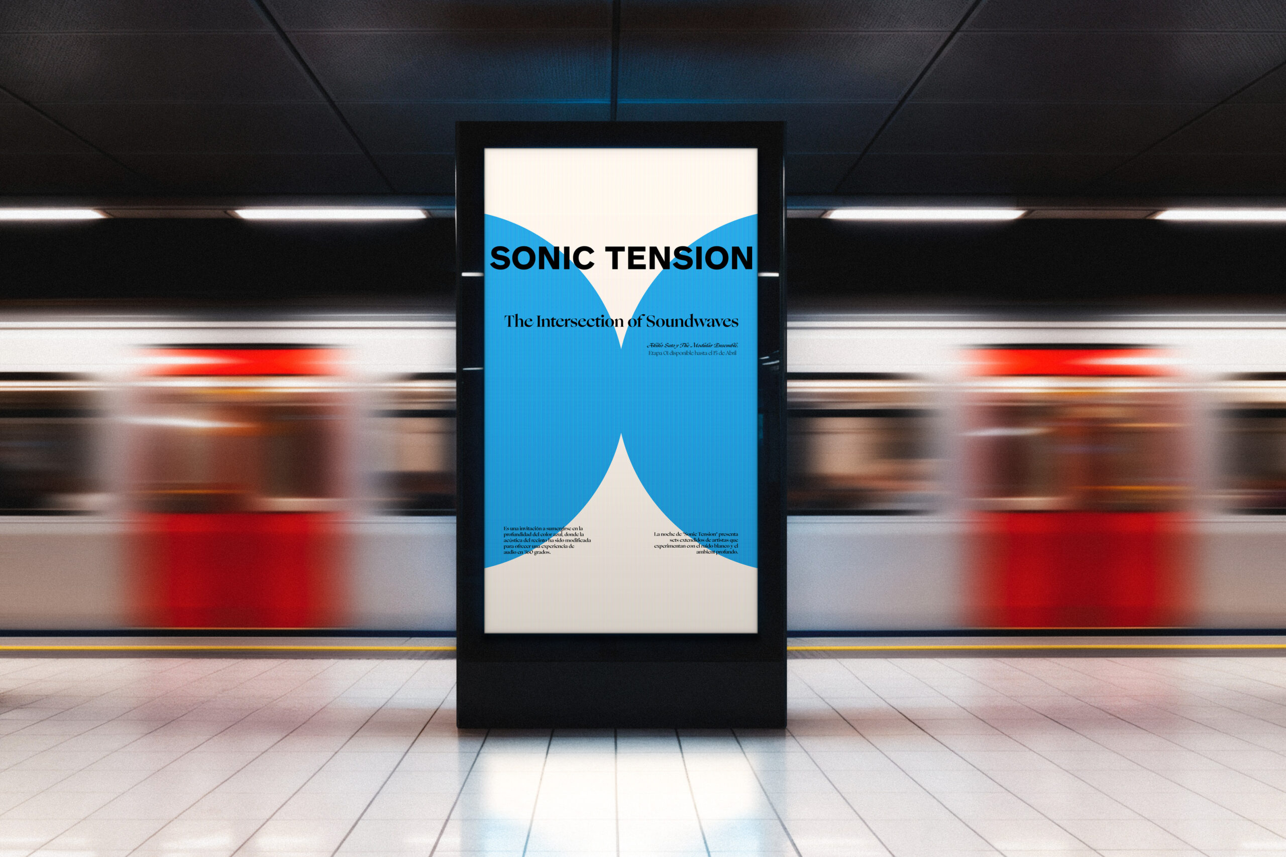
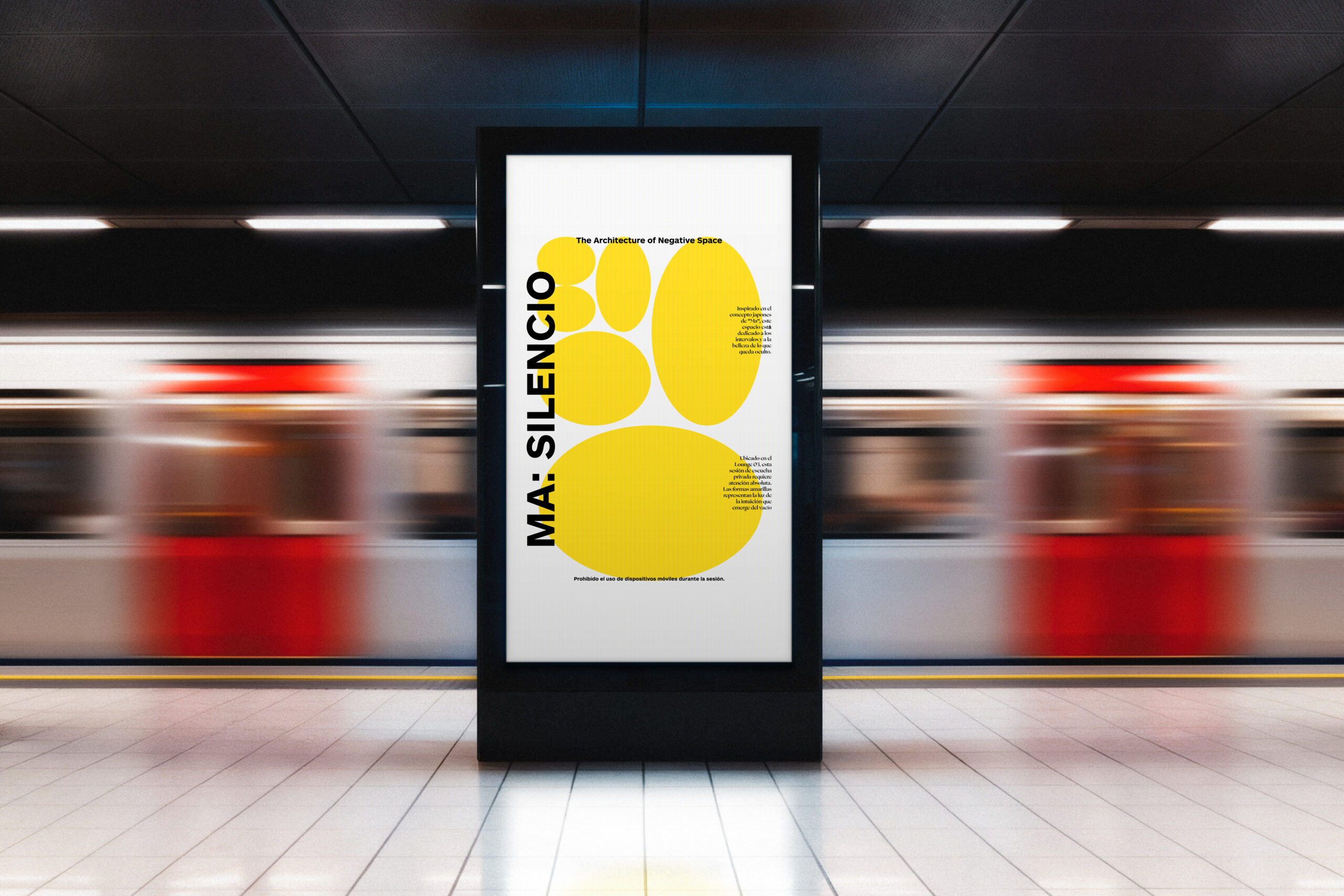
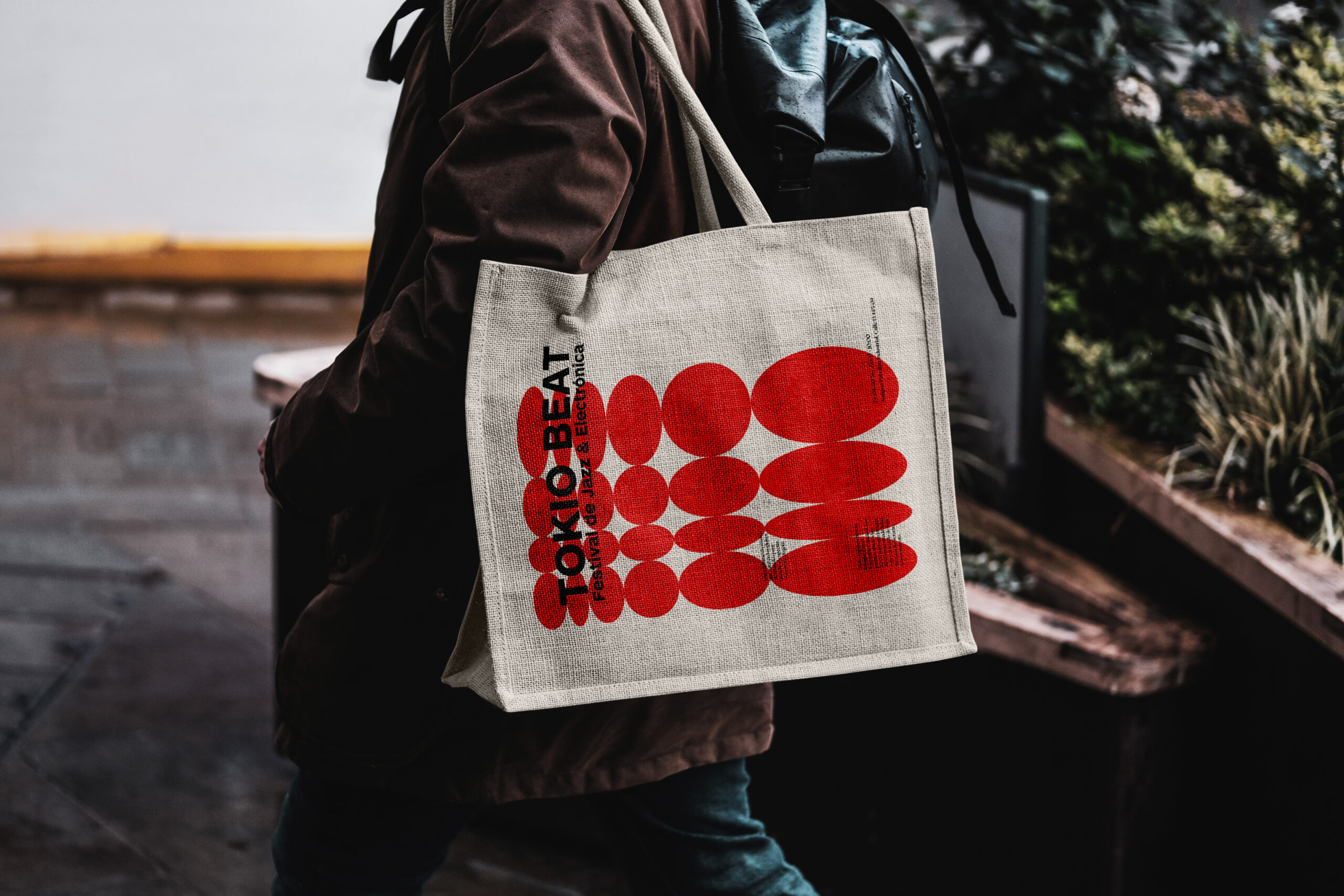
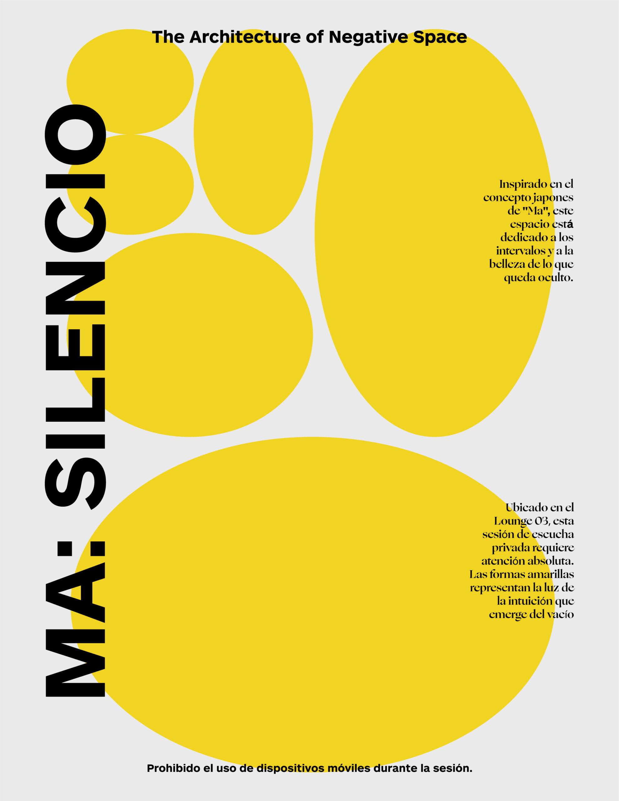
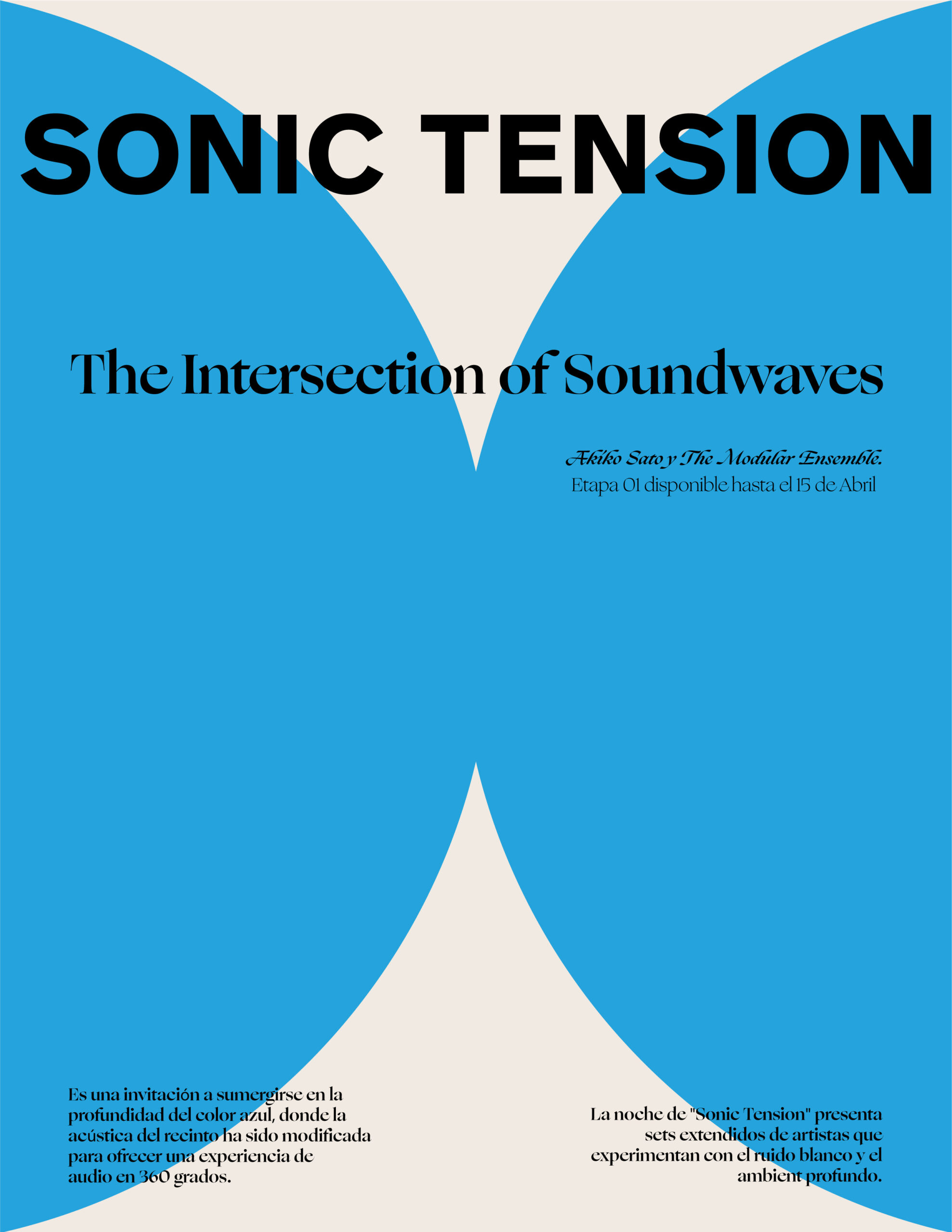
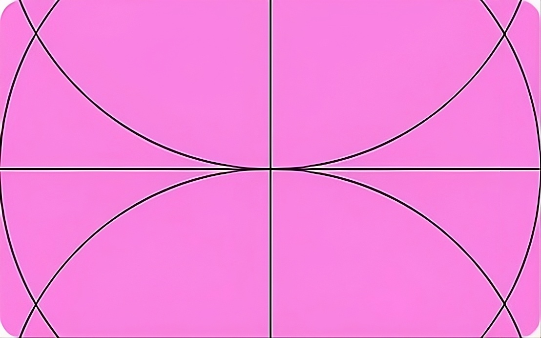
Tokio Beat is a jazz and electronic music festival that needed an identity capable of housing three radically distinct events under one visual system. Each event had to feel autonomous — its own color, its own compositional logic — while still belonging to the same family. The solution was a modular grid that each poster inhabited differently. Tokio Beat filled it with ovals in rhythmic crescendo. Ma: Silencio used three oversized forms and the Japanese concept of Ma — the beauty of what is left empty. Sonic Tension dismantled the grid entirely, letting curved negative space create tension and release.
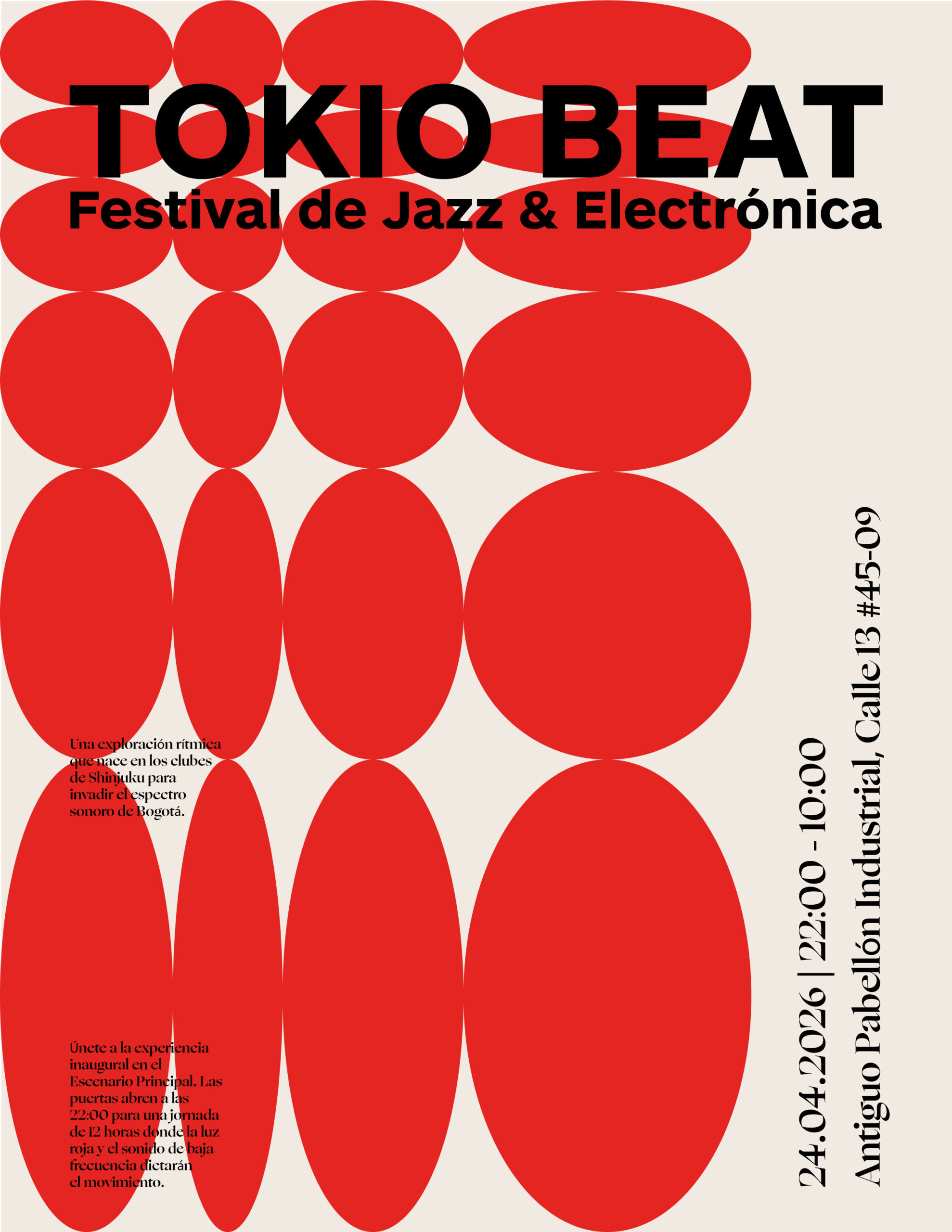
Each poster is based on a different grid: a visible structure of rectangles within which the ovals fit, spill over, or are completely ignored. This tension between the container and the shape is what unifies the three works without making them look alike.
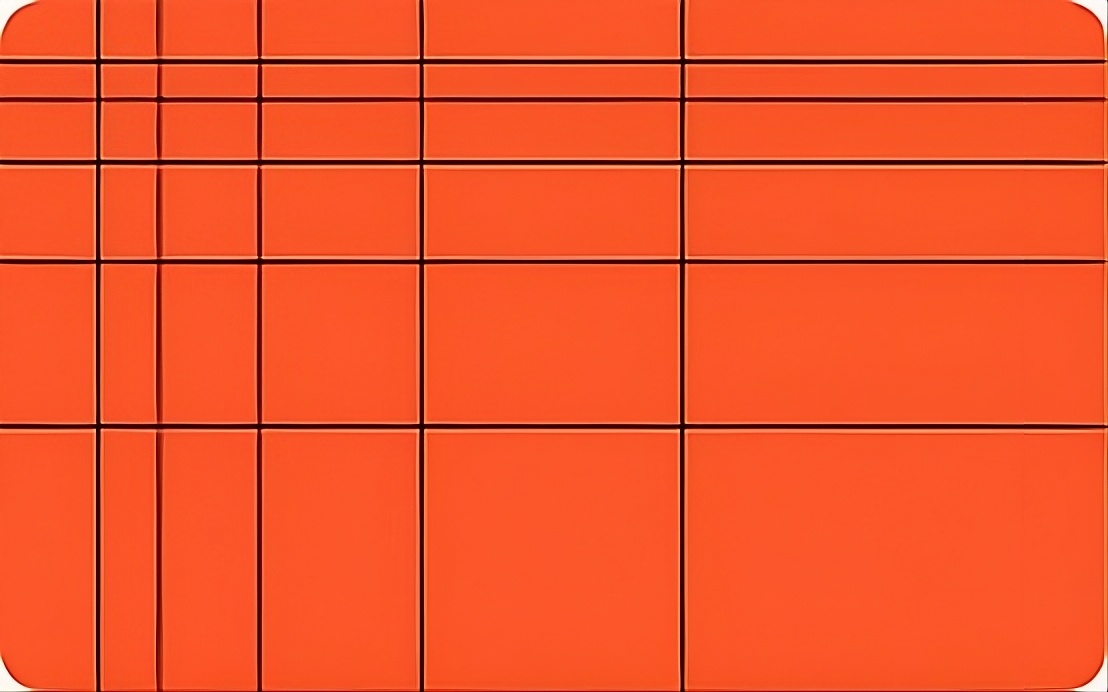
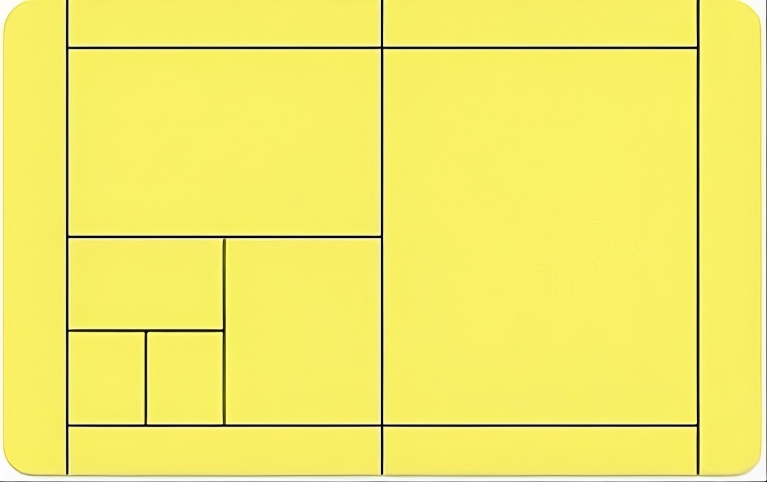
The grid is the invisible backbone. Each poster uses the same modular system of rectangles, but inhabits it differently — filling it, emptying it, or breaking through it. The grid makes three radically different posters feel like one system.
Ma: Silencio and Sonic Tension are built around what is not shown. In Ma: Silencio, three giant ovals leave intentional voids that become the protagonist. In Sonic Tension, four arcs carve a negative space out of the field — the shape only exists in what surrounds it.
Red for Tokio Beat — urgency and pulse. Yellow for Ma: Silencio — warmth and intuition. Blue for Sonic Tension — depth and frequency. Each color is the event's primary identity marker. The typography stays black across all three — the only constant in the system.